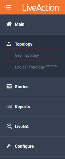
Topology
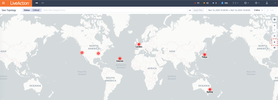
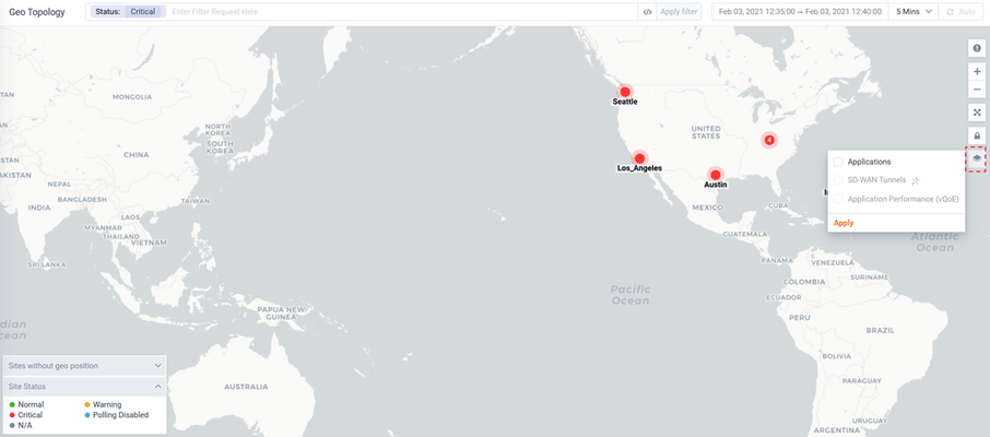
Geo Topology
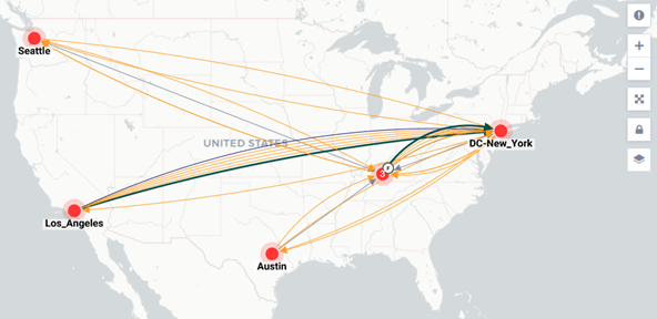
The Geo Topology provides an overview of the sites monitored by LiveNX. It can be used for understanding site status, projecting application traffic between sites and monitoring SDWAN.
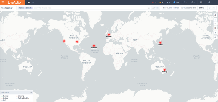
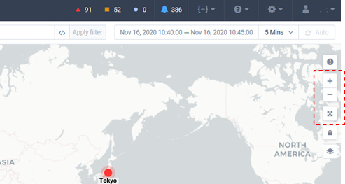
The icons to the upper right of the map provide context to what is shown on the topology.
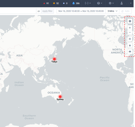
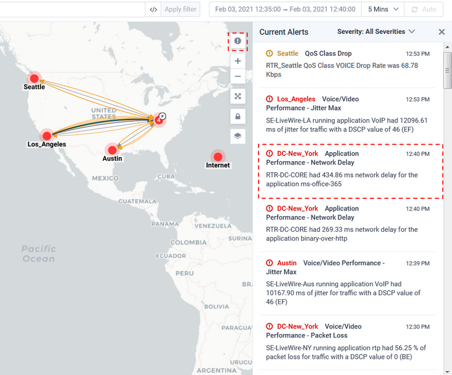
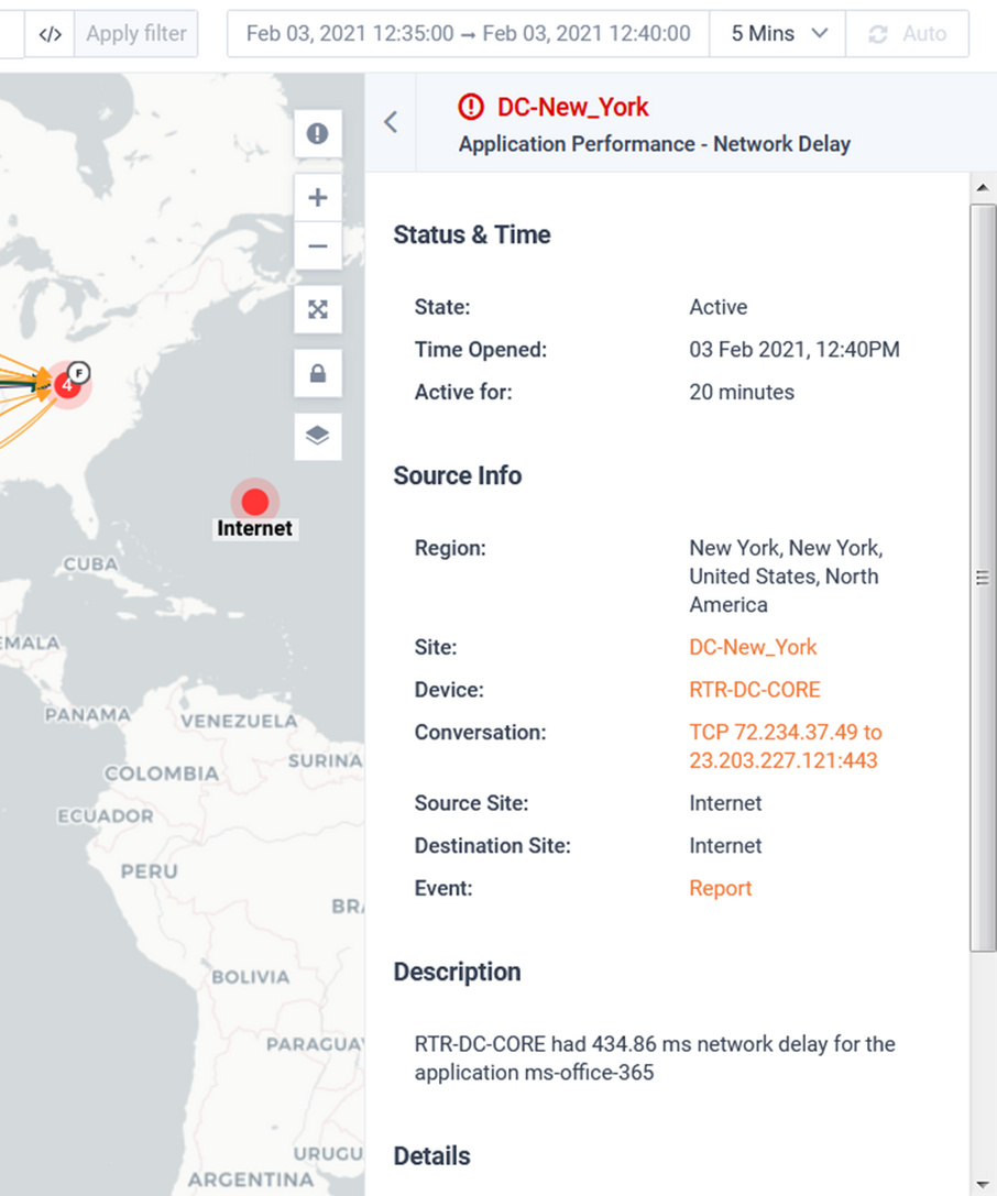
The Current Alerts icon will provide a list of the most recent active Alerts. Clicking on an alert will provide more details and drill-down to additional data.
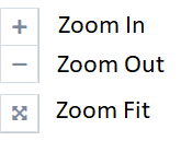
The below icons allow you to focus on the desired area of the map.
When the Toggle Layout Lock is unlocked, it allows you to click-and-drag a Site icon to the position desired. If geo location has been configured for a Site, the Site will default to the Site’s geo-coordinates.
The Toggle Display Mode icon controls what technologies area overlaid on the Geo Map.
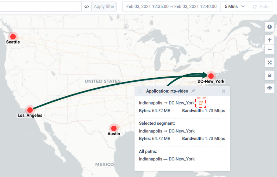
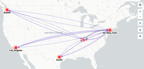
Applications will overlay application traffic on the Geo Map.
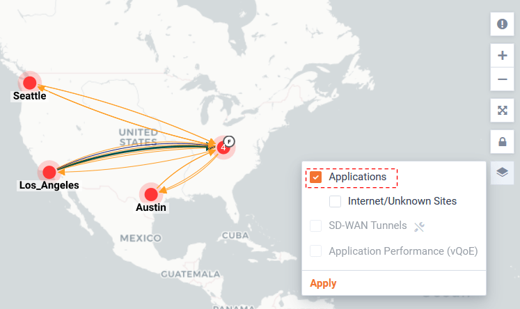
By clicking on the Application traffic of interest, a pop-up will show details of the Flow. Click on the cross-launch icon will open a curated Sankey diagram on a new browser tab.
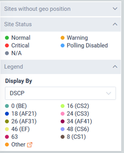
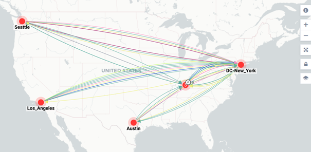
The Legend can be updated to select the context to show the application data.
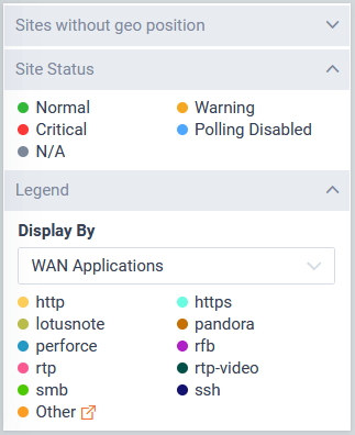
The Legend can be updated to select the context to show the Application traffic. In this example the Display By is set to WAN Applications.
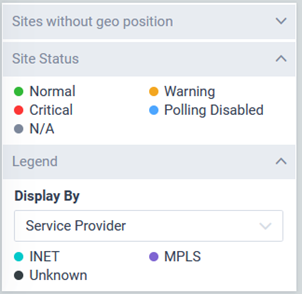
In this example the Display By is set to Service Provider.
In this example the Display By is set to DSCP.
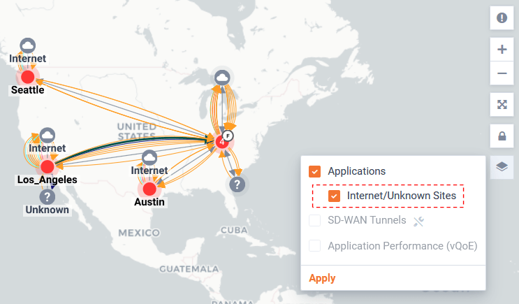
Internet/Unknown will toggle showing applicable icons for each site sending Flow to either Internet or Unknown sites.
SD-WAN will toggle showing SDWAN tunnels between sites.
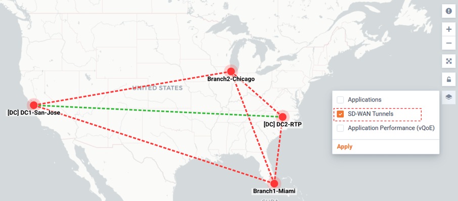
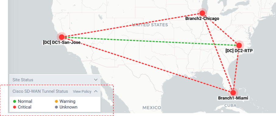
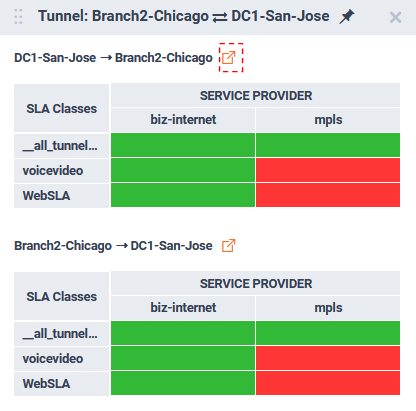
Tunnels are color coded by status.
Clicking on a tunnel, will pop-up summary details about the tunnel status.
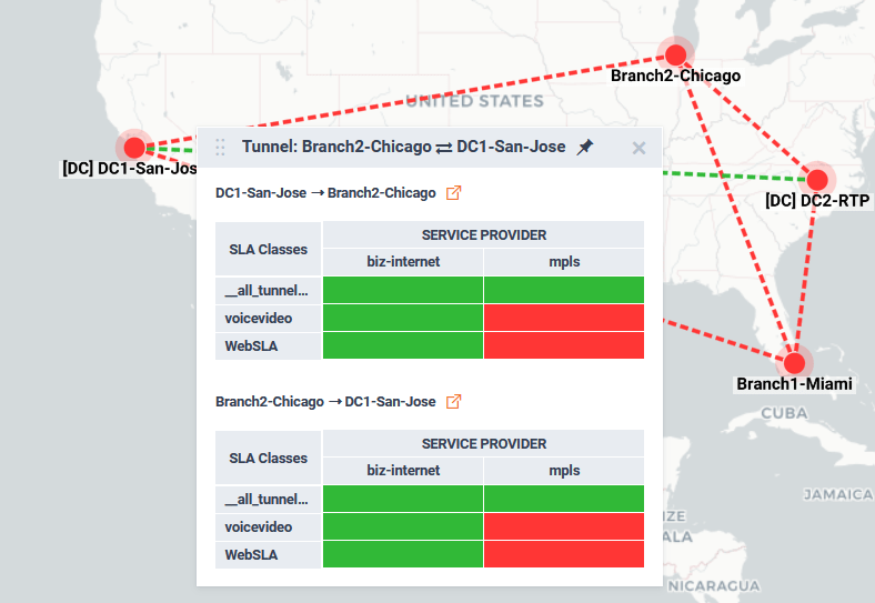
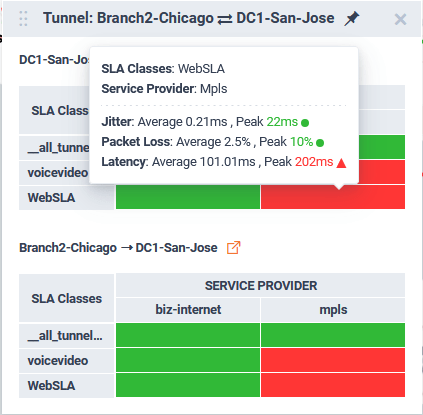
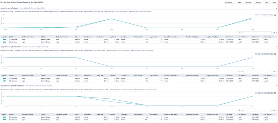
Hovering over a SLA Class/ Service Provider status block will provide more details. Clicking on the status block will open a curated SDWAN report highlight Jitter, loss, and delay metrics for the tunnel.
Clicking on a tunnels pop-up icon will open a Sankey diagram for the tunnel.
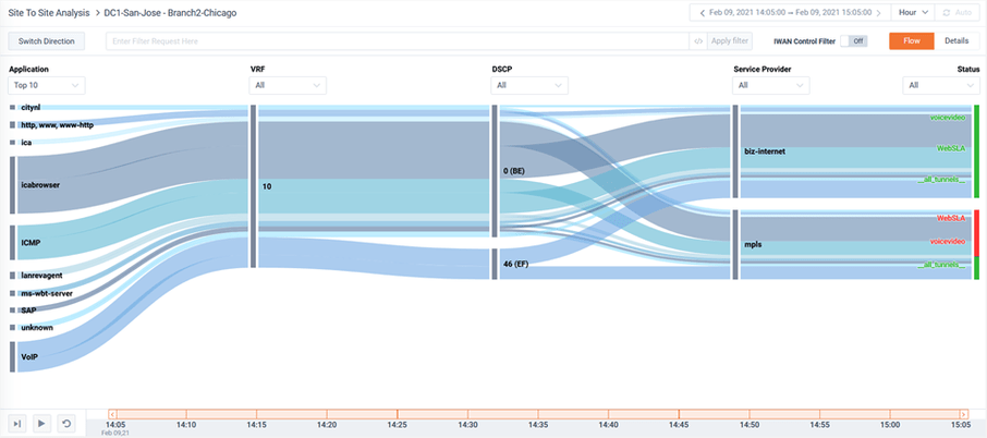
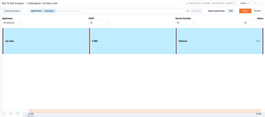
This Sankey is curated to focus on SDWAN performance. The Sankey diagram highlights the applications, the VRF, their DSCP, the service provider path the application took, and its status. For more details for the options of the Sankey page please refer to the Site To Site Analysis Story.
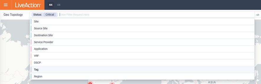
Filtering can be applied to find the specific Flows, Tunnels, and/or sites with specific status of interests.
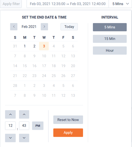
Historic time ranges can be selected for finding the Flows of interests.
The page can optionally be auto-refreshed by toggling the Auto button in the top right of the page.