Bar chart
The bar chart dashlet allows several aggregated KPIs to be displayed in one dashlet. Select the KPIs and describe the preferred way to display the metrics.
Create a bar chart dashlet by clicking
 in the edition tool bar.
in the edition tool bar.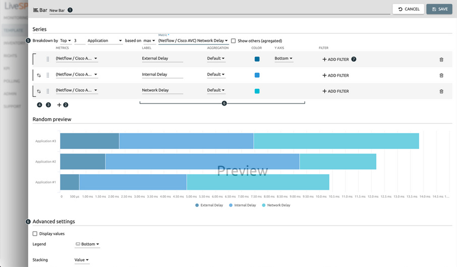
1. Name your dashlet.
2. Select KPIs from the KPI library.
3. Move the series.
4. Stack the series.
5. Specify breakdown on displayed element:
• none = one bar per chosen KPI is displayed,
• all = KPIs will be grouped and split by network element selected,
• top = KPIs will be grouped and split by network element selected for the top functionality,
• list = KPIs will be grouped and split by selected network element.
6. Sketch the style of the different bars and customize your layout (legend, axis, etc.).
7. Filter the data set.