Timeline chart
Timeline helps visualize spikes of traffic and understand performance metrics such as latency over time. The timeline dashlet tools provide standard and advanced functionalities to mix KPIs, configure multi-axes, add thresholds and choose chart types. As many features are optional, it is possible to start with a quick, one-KPI visualization and then turn to multi-KPI / multi-sources visualization.
Create a timeline dashlet by clicking
 in the edition tool bar.
in the edition tool bar.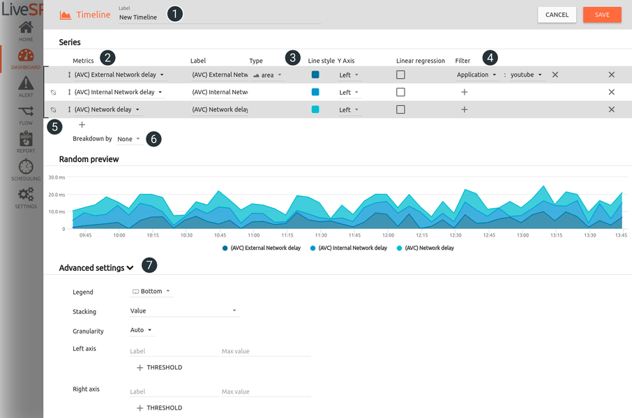
1. Name your dashlet.
2. Select KPIs from the KPI library.
3. Sketch the style of the different lines.
4. Filter the data set.
5. Stack and move the series.
6. Specify breakdown on displayed element:
• none = one line per chosen KPI is displayed
• all = KPIs will be grouped and split by network element selected
• top = KPIs will be grouped and split by network element selected for the top functionality
• list = KPIs will be grouped and split by selected network element
7. Customize your layout (legend, double axis, threshold, etc.)