Graphs tab
The Graphs tab of the Flow Visualizer displays graphs of data across time.
To show a graph for display, select the graph type. Multiple graphs can be displayed simultaneously.
There are five types of graphs:
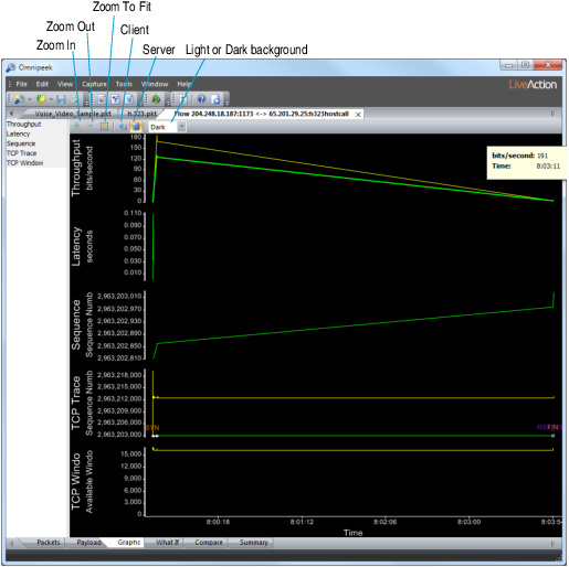
The parts of the Graphs tab are identified below.
• Zoom In: Click and drag a rectangle across the portion you want to see to zoom into a specific portion of the graph.
• Zoom Out: Click to decrease size of graph.
• Zoom to Fit:Renders the entire graph within the available screen space.
• Client: Click to switch graph display to direction from client to server.
• Server: Click to switch graph display to direction from server to client.
• Light or Dark: Select a background for graphs from the drop-down list in the toolbar.
Some graphs (Sequence, TCP Trace) display sequence numbers as a vertical axis. To show relative values, right-click and enable . See Relative SEQ/ACK numbers.
• Right-click options:
• Relative Time:Displays a horizontal axis with time relative to the first packet in this flow.
• Absolute Time: Displays a horizontal axis with clock time.
• Data tips: Hold the mouse cursor still over a point on any graph to display a data tip for that point.
• For an axis, this shows the value of that axis at the current cursor.
• For empty graph areas or lines between graph points, this shows the vertical and horizontal values for that point.
• For graph points, this shows graph-specific data about that point.
• Magnifier lens: To magnify the graph area around the cursor, hold down the key or press the key. A small view magnified by 4x appears in the lower right corner.
Throughput graph
The Throughput graph displays the rolling average throughput for the flow, in TCP Sequence Number order over time.
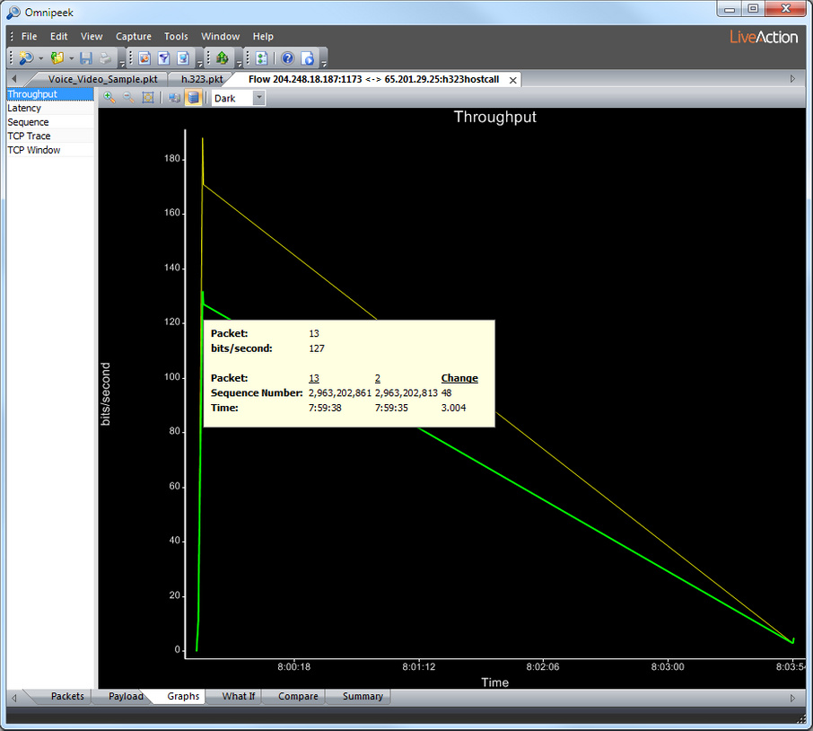
NOTE: While most throughput calculations display the total number of bytes over time, the Throughput graph ignores IP/TCP headers and checksums. It includes only actual TCP payload data in its calculations.
There are two lines in the Throughput graph.
• The thin yellow line shows the rolling 1-second average value of throughput. This line tends to change frequently.
• The thicker green line shows the rolling 10-second average value of throughput. This line changes more slowly.
NOTE: The Throughput graph does not display data for the first 0.5 seconds of data. There is not enough data collected during this period, and the graph tends to display incorrect values until after 0.5 seconds.
Both the 1-second and 10-second lines will display data before 1- and 10-seconds have elapsed. In this case, the graphed data is the average throughput up to that time. Both the 1- and 10-second lines show the same data up to the 1-second mark.
The Throughput graph only calculates points when there is a packet. Long spans without packets create long spans with straight horizontal lines. Sawtooth waves are common for flows that have bursts of large packets interspersed with zero-data packets.
Latency graph
The Latency graph displays the time between a packet and the request packet that it acknowledges.
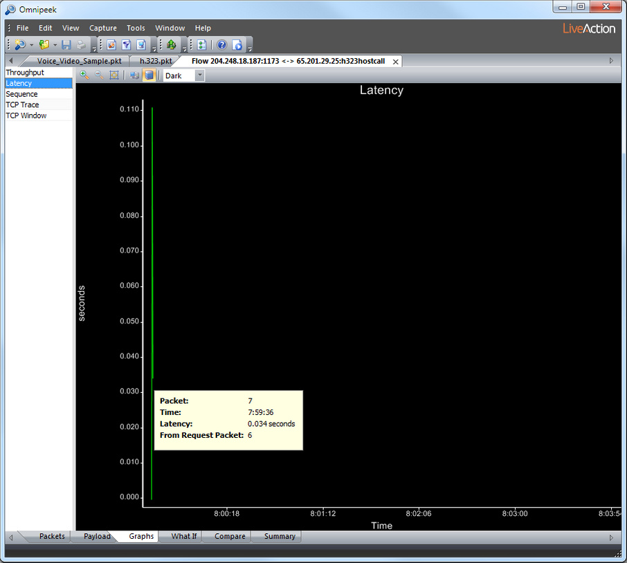
NOTE: Not all flows have latency data. If a flow direction does not have an increasing SEQ number, then the other direction does not have anything to ACK, so the other direction will not have latency data.
Sequence graph
The Sequence graph displays TCP SEQ numbers across time. It displays a simple version of the information in the TCP Trace graph.
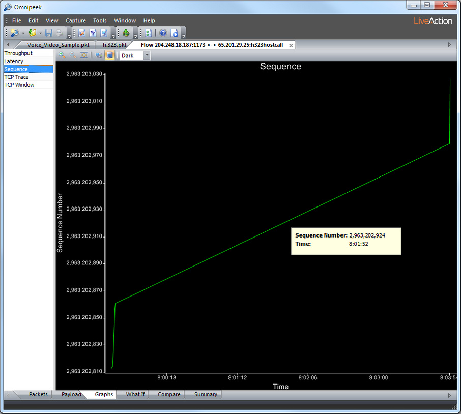
Sharp increases in SEQ indicate a burst of high throughput. Flat horizontal lines indicate zero TCP data throughput. Downward sloping lines indicate out-of-sequence or repeated data.
TCP Trace graph
The TCP Trace graph creates a rich visualization of a TCP flow, showing two stairstep lines, representing current ACK’ed data (green) and available window (yellow). This shows how well the client is keeping up with data.
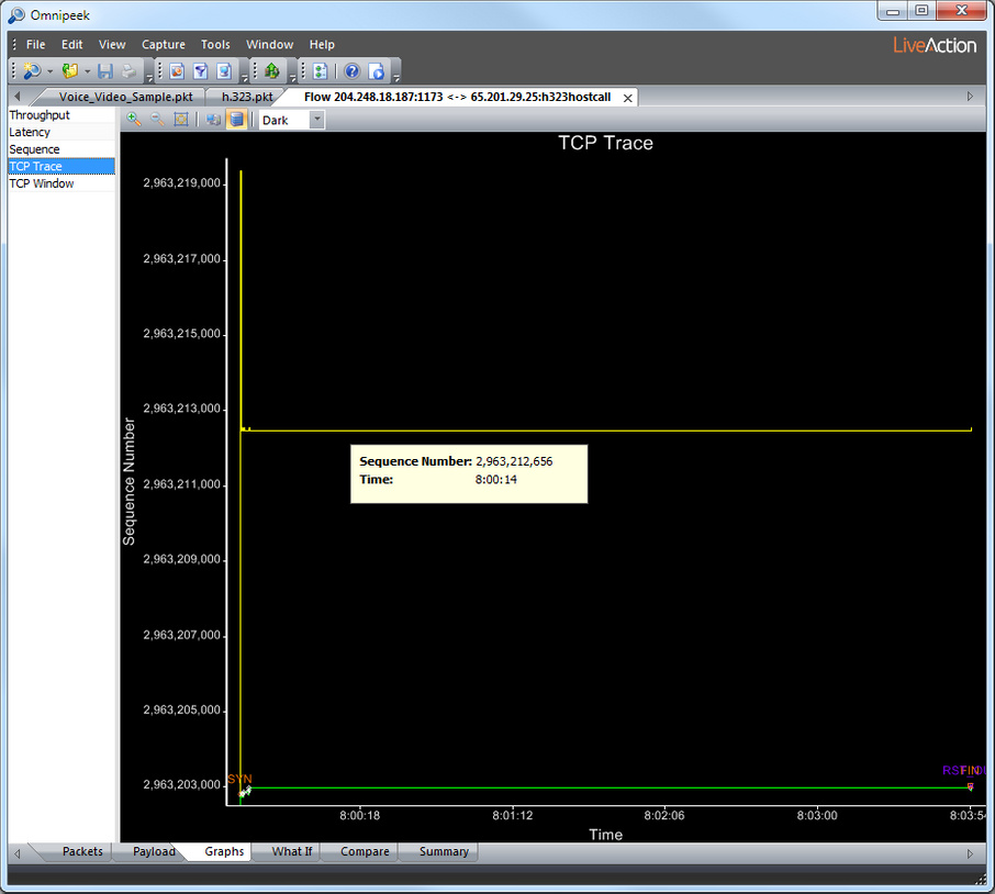
Vertical white arrows indicate each sent data packet, showing how and when the server is talking. As the client ACKs data, the green stairstep line bumps up.
If the client sends an ACK without increasing the ACK number, the TCP Trace graph notes this with a small green tick mark.
As the client slides its window forward or increases its window, the yellow stairstep line bumps up. If the client sends an ACK without moving the window forward, the TCP Trace graph notes this with a yellow tick mark.
As the server sends data, white arrows appear. Each arrow starts at the packet’s SEQ number and goes up to span that packet’s TCP payload size. Packets without payloads appear as small white X marks (the arrowheads for both SEQ and ACK land on the same point).
The TCP Trace graph shows all TCP flags. For a complete list and description, see Flow Visualizer TCP Trace graph flags.
TCP Window graph
The TCP Window graph (shown below the TCP Trace graph in the following figure) shows the size of the available TCP window as it expands and contracts through the course of the TCP session in the current flow.
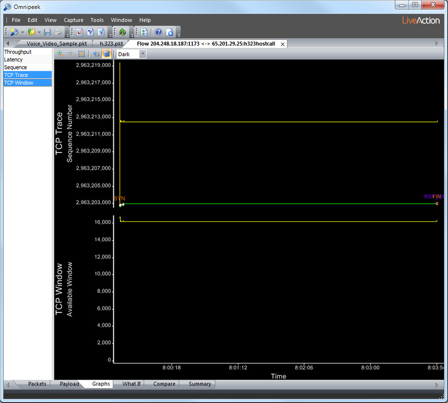
The TCP window is the amount of unACK’ed data a particular TCP session will allow on the wire. When a receiver is keeping up with the sender, the available window floats near the top of its range, typically around 64K. As the receiver buffers more and more data, unable to immediately acknowledge its receipt, the available window shrinks. If it dips too low, the Expert will flag this event. When the available window reaches zero (the window is all used up), the sender stops and throughput suffers. Properly tuning TCP windows can have a significant effect on TCP throughput.
TCP Window graphs show data tips, using the same format and information found in TCP Trace graphs.